Image ratios might seem like a minor detail, but they’re the difference between a website that looks professionally designed and one that looks like it was assembled during a coffee break. Getting your image proportions right is like choosing the perfect frame for a masterpiece – it can make or break the entire visual experience.
Understanding the Golden Rules of Image Ratios
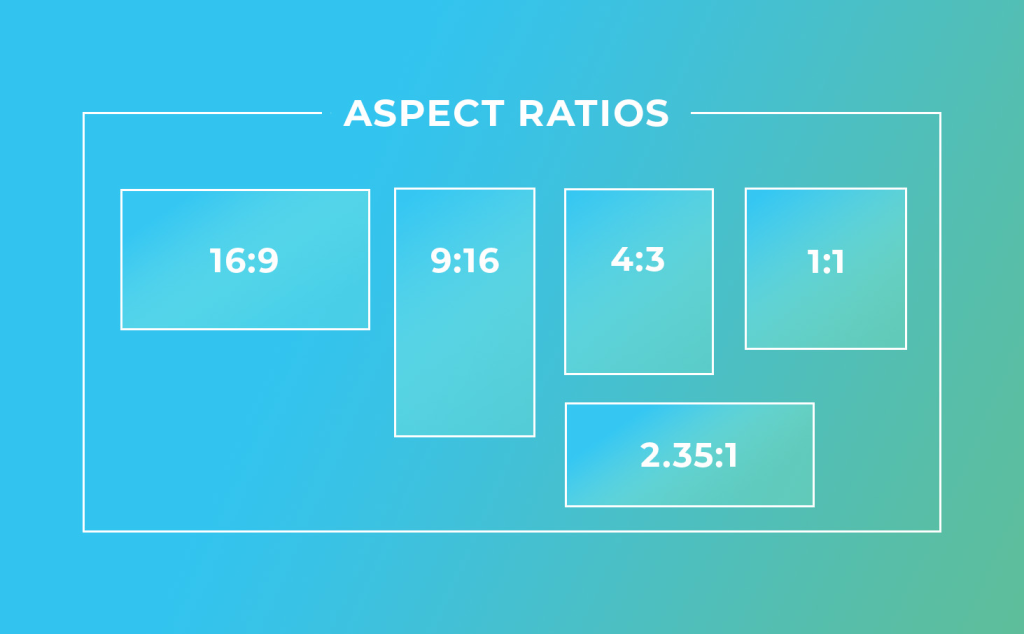
Every image ratio tells a story and serves a purpose. The classic 16:9 ratio feels cinematic and modern, perfect for hero banners and video thumbnails. The 4:3 ratio offers a more traditional, balanced feel that works beautifully for product photography. Square 1:1 ratios create harmony and work exceptionally well for social media integration and profile pictures.
The key is consistency. When your website uses a chaotic mix of image ratios, it creates visual tension that makes visitors unconsciously uncomfortable. It’s like listening to music where every song is in a different key – technically it might work, but it feels off.
Think of image ratios as the rhythm of your visual design. Just as a good song has a consistent beat that lets other elements shine, consistent image ratios create a visual framework that allows your content to flow naturally.
Common Ratio Mistakes That Kill Your Design
The Stretch and Squish Syndrome: Nothing screams “amateur hour” louder than stretched or squished images. When you force a square image into a rectangular space, faces look like fun house mirrors and products appear distorted. Always crop and resize properly rather than stretching images to fit.
Inconsistent Blog Post Images: Having one blog post with a tall vertical image, another with a wide horizontal banner, and a third with a square thumbnail creates a chaotic, unprofessional appearance. Pick a ratio for your blog posts and stick with it religiously.
Ignoring Mobile Ratios: An image that looks perfect on desktop might become an unusable sliver on mobile devices. Consider how your chosen ratios will display across different screen sizes, especially for important hero images and call-to-action banners.
Choosing Ratios That Work for Your Content
For e-commerce sites, consider your products’ natural proportions. Clothing might work better in a 3:4 portrait ratio, while electronics often shine in a 4:3 or 16:9 landscape format. The ratio should complement your products, not fight against them.
Blog and content sites typically benefit from consistent 16:9 ratios for featured images. This ratio works well for most topics and creates a professional, magazine-like appearance. It’s also optimized for social media sharing.
Portfolio and photography sites have more flexibility but should still maintain consistency within categories. You might use 3:2 for landscape photography, 4:5 for portraits, and 1:1 for Instagram-style squares, but keep each category consistent.
Pro Tips for Ratio Implementation
Use your image ratios to guide the viewer’s eye and create visual hierarchy. Larger ratios naturally draw more attention, so reserve your most prominent ratios for your most important content.
Consider creating a style guide that documents your chosen ratios for different content types. This ensures consistency even when multiple people contribute content to your site.
Remember that white space is your friend. Don’t feel compelled to fill every pixel – sometimes a smaller image with breathing room looks more professional than a large, cramped one.
Perfect image ratios aren’t about following arbitrary rules – they’re about creating visual harmony that lets your content shine. When visitors can focus on your message instead of being distracted by inconsistent imagery, you’ve mastered the art of professional web design.